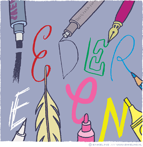
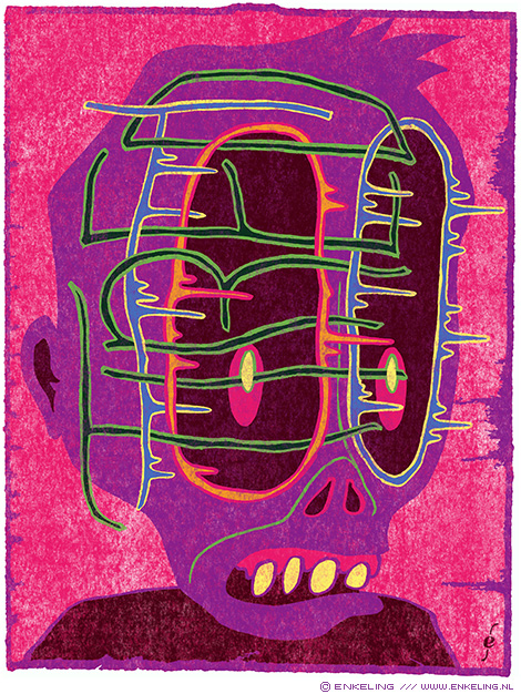
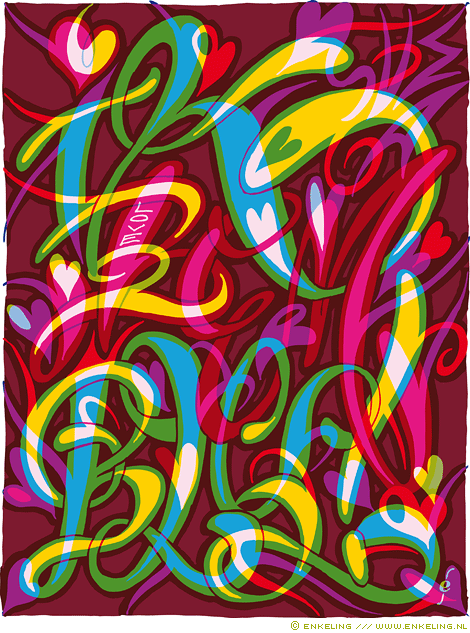
Too Tired
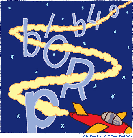
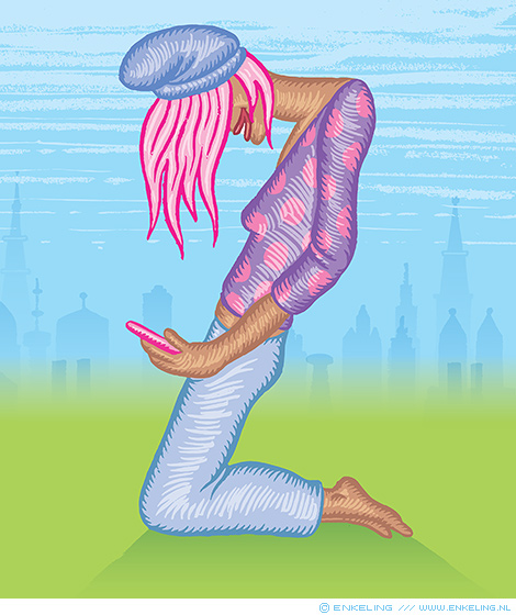
There’s some lettering hidden in there. Inspired by another sleep deprived night
There’s some lettering hidden in there. Inspired by another sleep deprived night
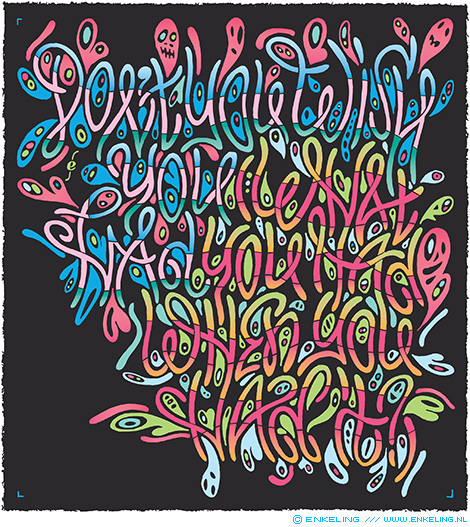
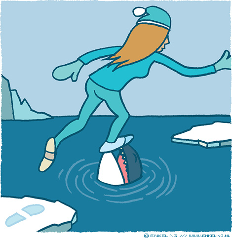
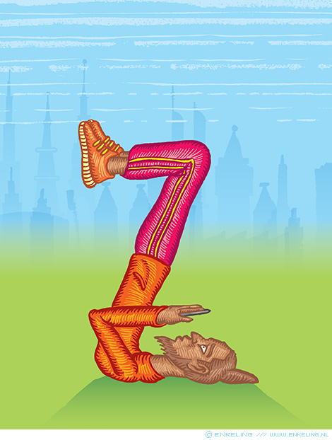
Typography inspired by the title of the 1970 track Don’t You Wish You Had (What You Had When You Had It) by Ruth Copeland.
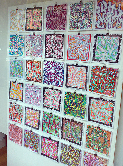
This month I’m showing some of my typographic odes to my daughter in Puntspatie’s Plantage Etalage here in Amsterdam. So come take a look if you are in the neighbourhood!
For some more information, go to Puntspatie’s site
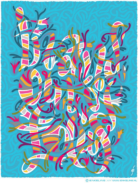
Typography inspired by the title of a 1970 In and Out of Focus by Focus by Dutch band Focus.
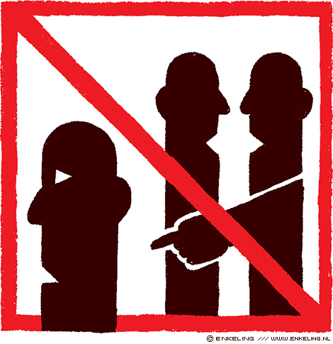
Illustrations for the article “Ten things you need to know about Gen Z” for Research World magazine
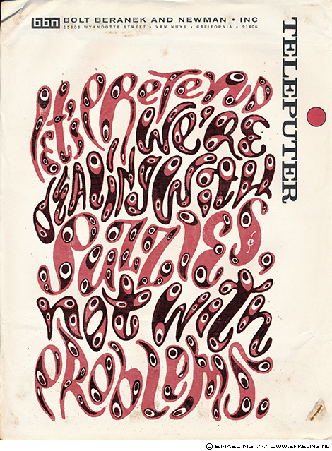
Inspired by something Quincy Jones said in an interview. Coloring and style inspired by feedback from Wim Wepster
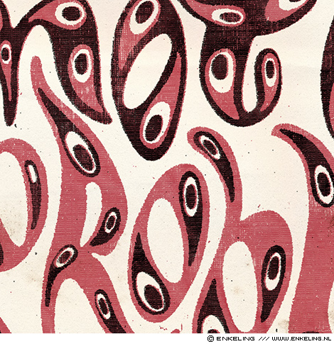
(detail)
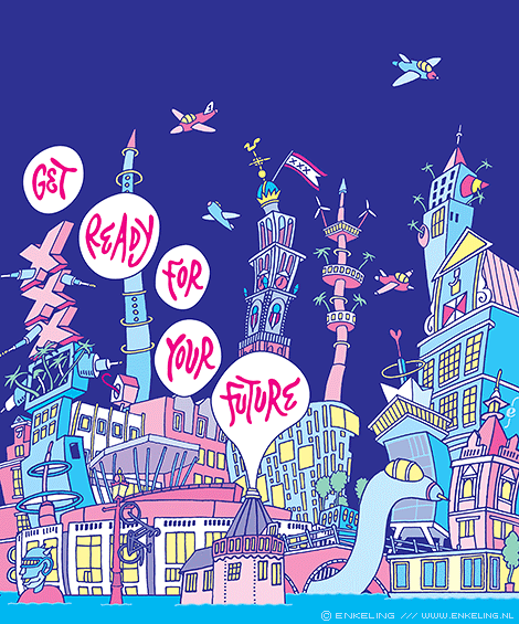
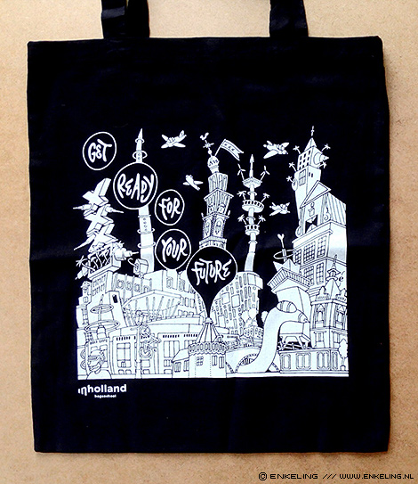
Illustration for Inholland, color version used on the cover of a magazine, black and white version for a bag handed out to freshman students
Typography for my daughter’s third birthday. Gefeliciteerd lieve Svea!
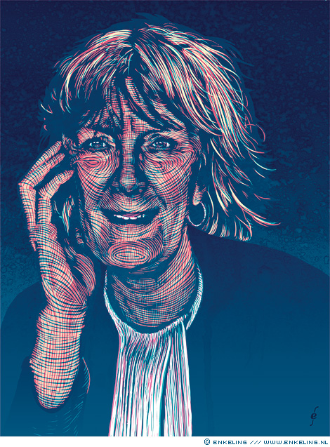
Portrait of lawyer Marianne Kubatsch for Dupe magazine.
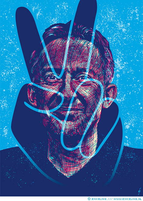
portrait of Belgian cultural historian, archaeologist and author David van Reybrouck for Dutch newspaper NRC Handelsblad
“Ik ben blij!” is something my daughter recently said. It means “I’m happy!”
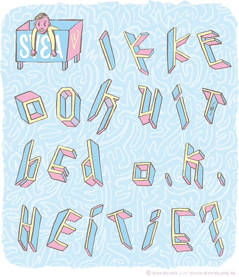
The text can be roughly translated as “Is it OK for me to get out of bed, Daddy?” and was one of the first sentences spoken by my daughter.
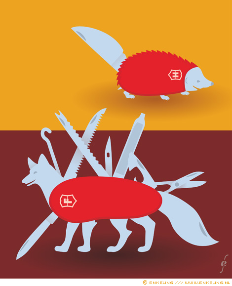
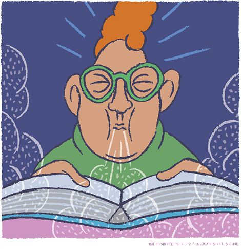
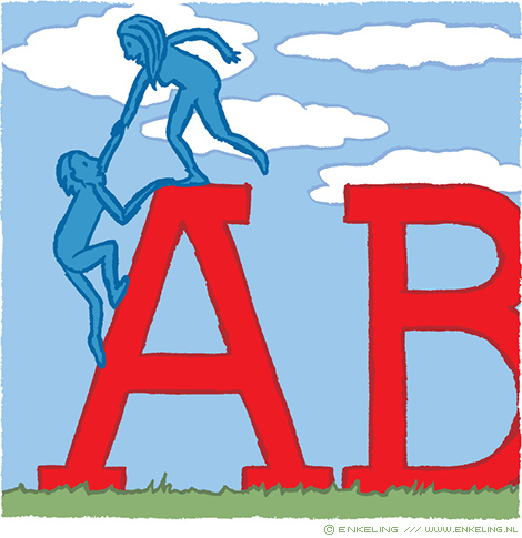
Illustration for the article “Foxes, hedgehogs, and the future of market research” for Research World magazine