10 in 2010
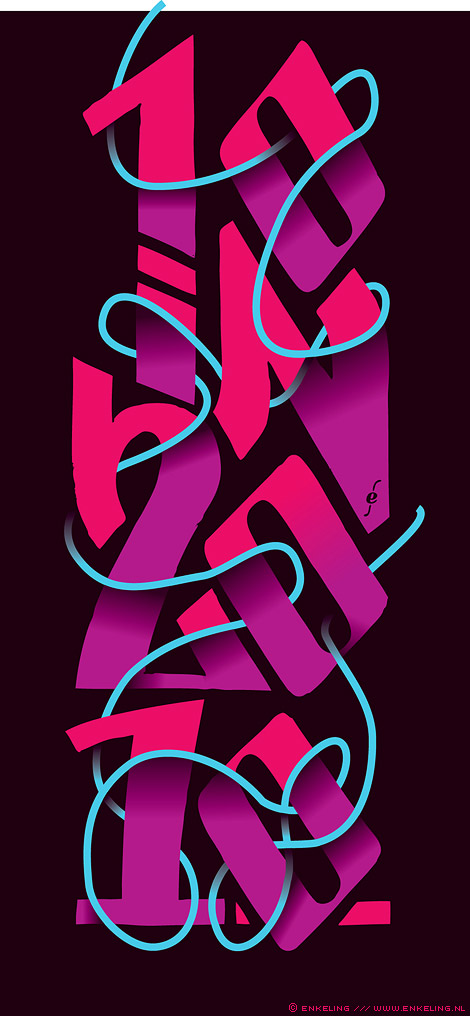
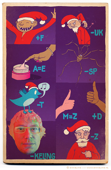
A discarded concept from 2010. Still like the lettering.
A discarded concept from 2010. Still like the lettering.
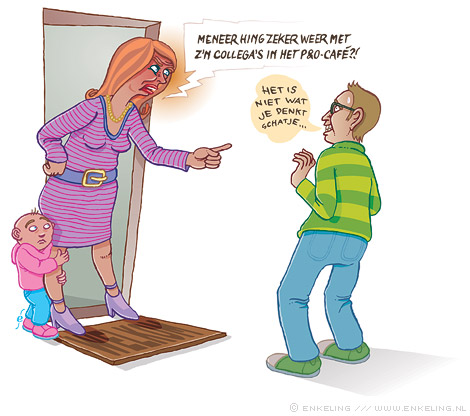
Illustration for Metaaljournaal.
“Ze worden P&O-cafés genoemd, de bijeenkomsten van een aantal kleinere technische bedrijven waar toekomstgericht P&O-beleid centraal staat.”
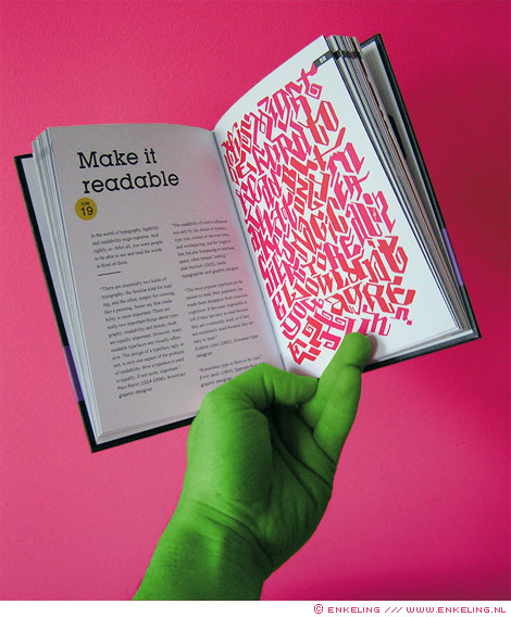
My contribution to Anneloes van Galen’s new book at BIS Publishers: Never Use More Than Two Different Typefaces
And 50 other Ridiculous Typography Rules.
For some more information, look here.
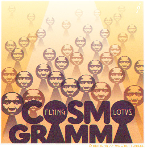
An alternative cover for the album Cosmogramma by Flying Lotus I made for kindamusik.net. To see it in its original context click here.
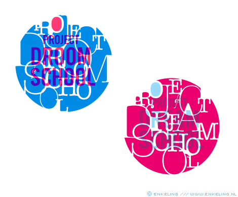
Two variations on a logo for Project Dreamschool.
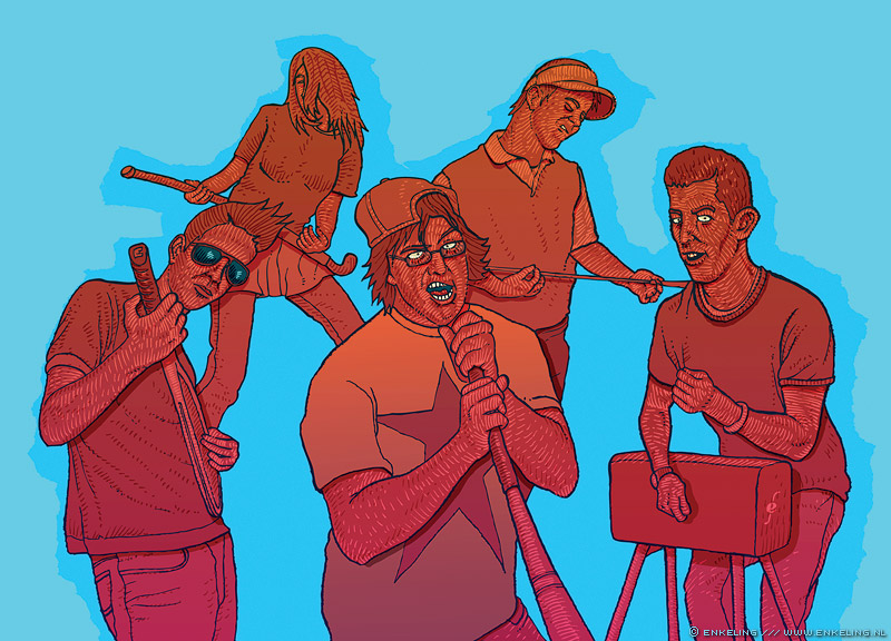
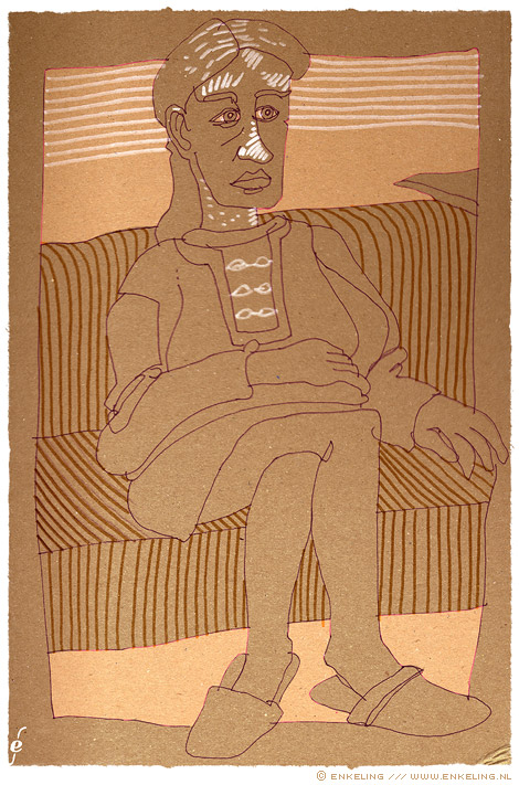
Illustration for Havana magazine.
Click on the image to enlarge.
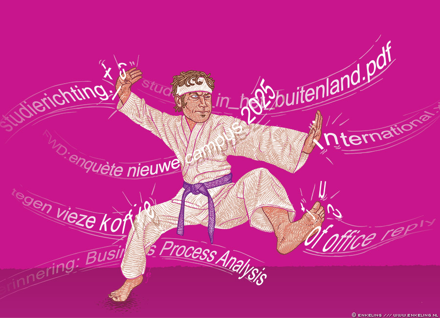
Illustration for Havana magazine.
Click on the image to enlarge.
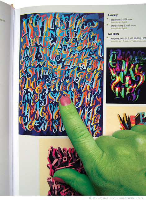
Some of my typographic work ( this one and that one ) got featured in the book Playful Type 2 by die Gestalten.
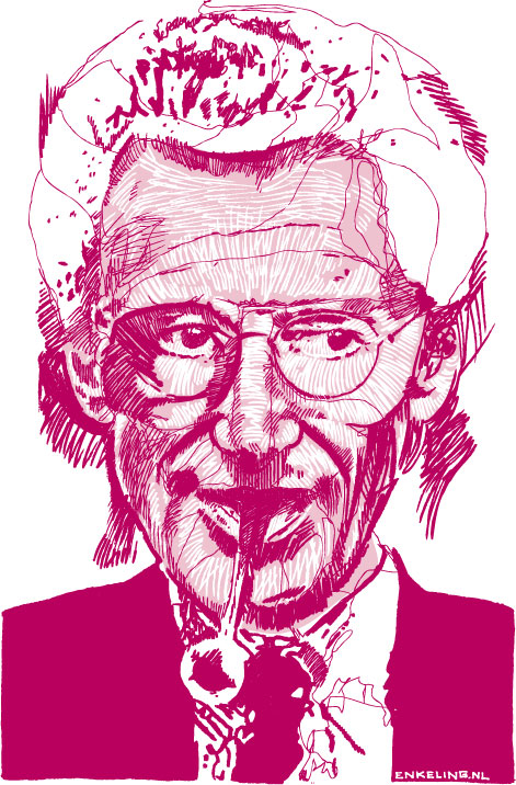
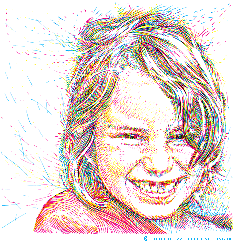
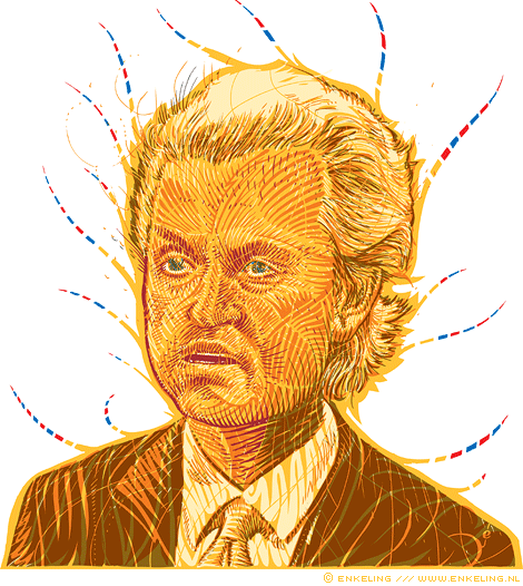
In tribute to Harry Mulisch, a portrait I did in 2006.