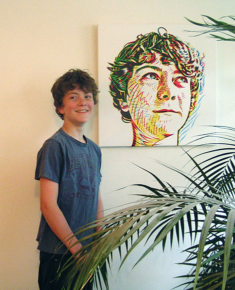
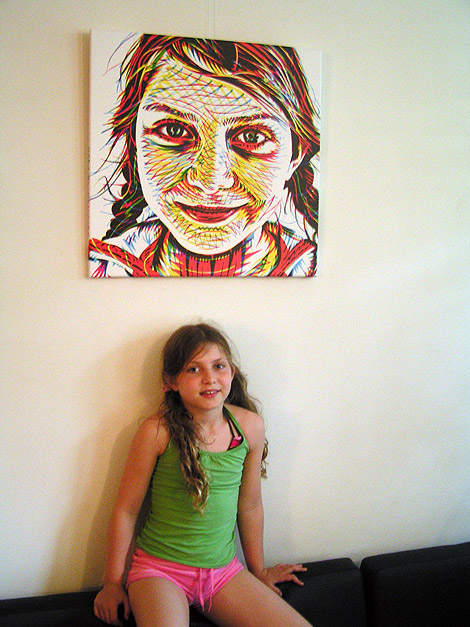
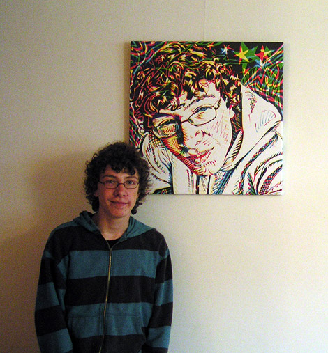
Yesterday I saw the prints of the portraits I made [see a few posts below]. They looked fine, great colors. I was a little worried if the typography I put on the sides of the canvases would be in its precise spot, but it turned out OK.
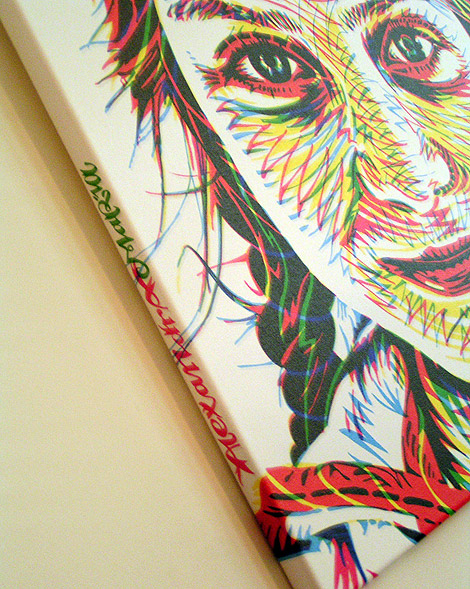


Yesterday I saw the prints of the portraits I made [see a few posts below]. They looked fine, great colors. I was a little worried if the typography I put on the sides of the canvases would be in its precise spot, but it turned out OK.

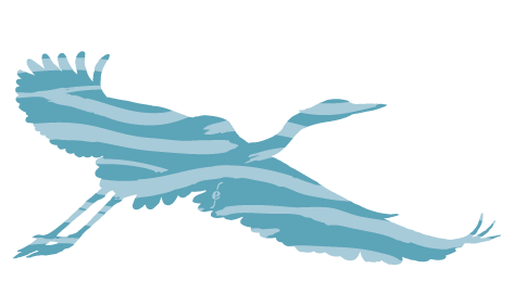
Illustration for PS van de Week
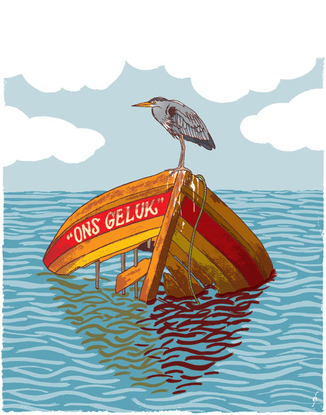
Illustration for PS van de Week
I did some typography for a project “Weerwoord” by the dutch YouTube. Used in the clip above and on the Weerwoord channel
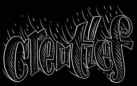
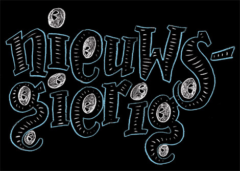
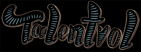
Some typography I did for the background of the channel:
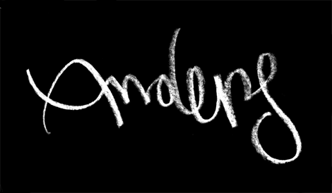
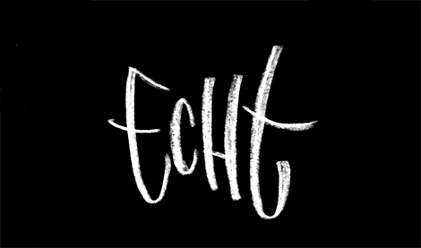
Here’s an earlier draft of the Weerwoord logo:
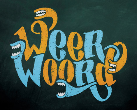
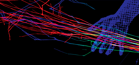
Illustration for an article about My Bloody Valentine on kindamusik.net. To see it in its original context click here.
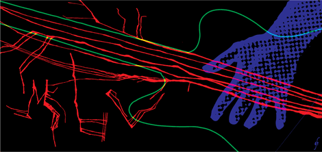
Illustration for an article about My Bloody Valentine on kindamusik.net. To see it in its original context click here.
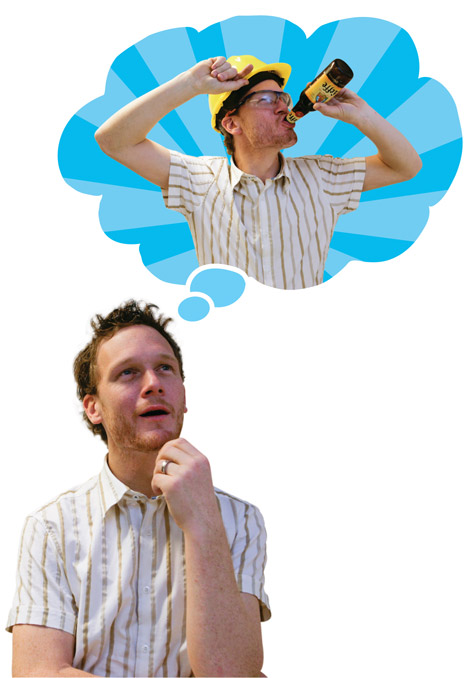
I had to make my mind up about posting some of these images here, because it doesn’t really fit into the rest of the work on this site.
Last year I did a series of photo comics and cartoons around courses in the metal industry, for OOM. Untranslatable for non-dutch speakers I’m afraid.
photography: Jordi Huisman, actor: Bart Broekhuijsen, props and additional photo manipulation: Frank Hijlkema