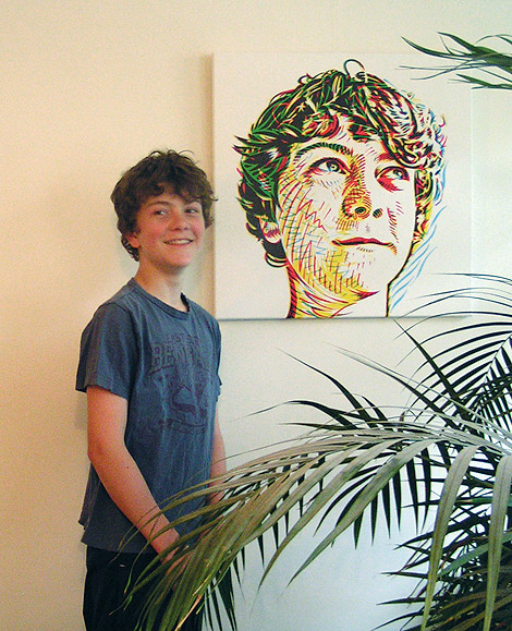
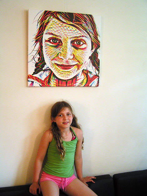
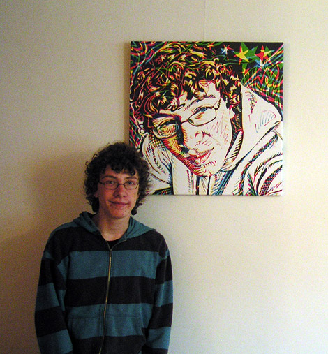
Yesterday I saw the prints of the portraits I made [see a few posts below]. They looked fine, great colors. I was a little worried if the typography I put on the sides of the canvases would be in its precise spot, but it turned out OK.
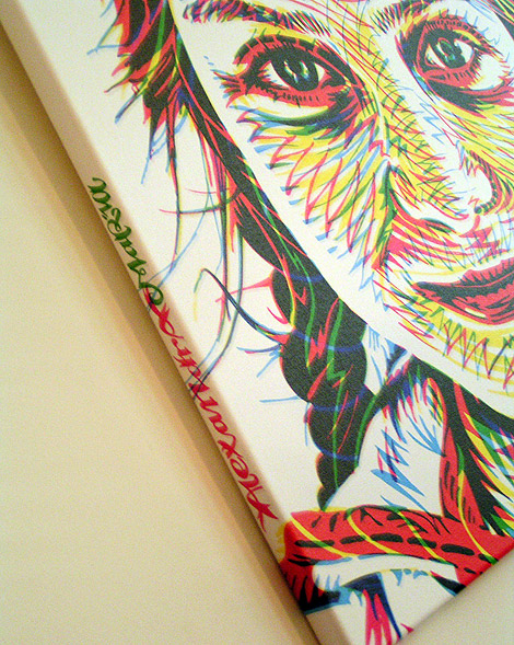


Yesterday I saw the prints of the portraits I made [see a few posts below]. They looked fine, great colors. I was a little worried if the typography I put on the sides of the canvases would be in its precise spot, but it turned out OK.

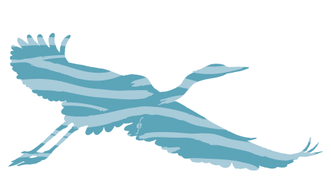
Illustration for PS van de Week
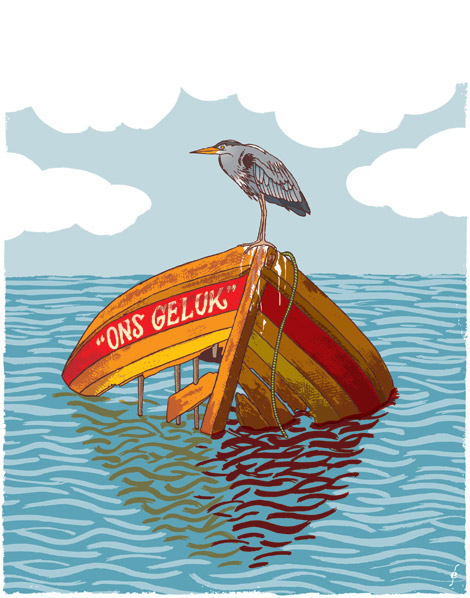
Illustration for PS van de Week
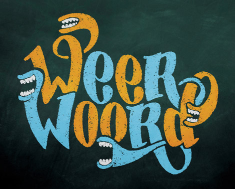
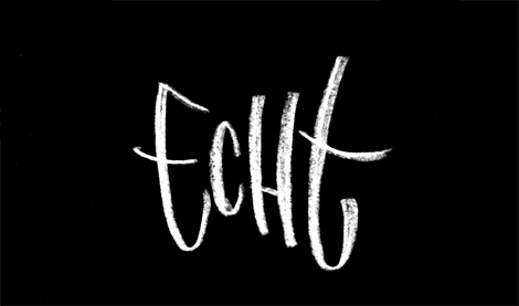
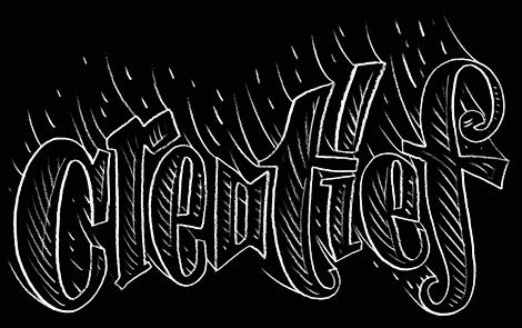
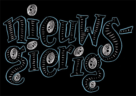
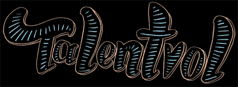
I did some typography for a project “Weerwoord” by the dutch YouTube. Used in the clip above and on the Weerwoord channel
Some typography I did for the background of the channel:
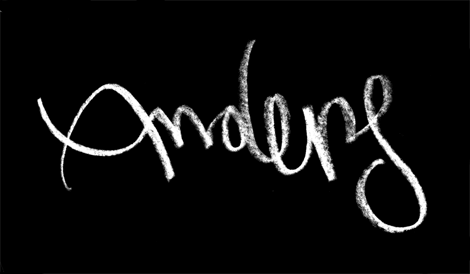
Here’s an earlier draft of the Weerwoord logo:
